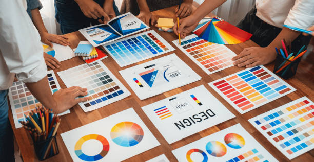
Color Theory - How Colors Shape User Experiences and Emotions
Color theory is the blend of science and art that explains how colors interact and influence our designs, whether for an app, website, advertisement, or tangible product. Colors aren’t just visuals—they’re powerful tools that can shift a user’s mood, guide their behavior, and make a product memorable. In UX design, mastering color theory is essential for crafting engaging and impactful experiences. In this article, we’ll explore the fundamentals of color theory, its core components, and how to apply it practically.
What is the Color Wheel?
Everything begins with the color wheel, a circular diagram that maps the relationships between different hues. The concept originated with Isaac Newton in the 17th century, published in his 1704 book Opticks. The color wheel typically includes 12 main hues: 3 primary colors, 3 secondary colors, and 6 tertiary colors.
In digital design, we use the additive color model, which relies on red, green, and blue (RGB). Combining these colors creates lighter results, culminating in white when fully mixed. Conversely, in print, we use the subtractive color model with cyan, magenta, and yellow (CMY), where adding colors produces darker outcomes, eventually reaching black. Understanding the difference between these models is crucial for choosing the right colors for your medium.
The color wheel isn’t just a theoretical tool—it’s a roadmap for creating harmonious color schemes. For instance, if you want a calm design, try analogous colors (hues next to each other, like blue and green). For a bold look, go for complementary colors (opposites, like red and green). Experimentation is key to discovering how colors work together.
Types of Colors and Their Psychological Impact
Colors fall into three main categories: warm colors, cool colors, and neutral colors, each with a distinct psychological effect on users:
-
Warm Colors: Think red, orange, and yellow. These hues evoke energy, passion, and warmth. Picture a sunset or a flickering flame—these are classic examples of how warm colors grab attention. However, if overused without balance, they can overwhelm the eye. That’s why they’re often used as accent colors to add vibrancy without dominating.
-
Cool Colors: Blue, green, and purple fall here. These colors convey calmness, trust, and relaxation. Blue, for example, is the most popular cool color globally, widely used in branding for its professional and dependable vibe. Found in nature—like the sky or sea—cool colors are soothing and easy on the eyes.
-
Neutral Colors: Black, white, gray, and brown. These are the least intense hues, often used for backgrounds or wireframing. Brown, technically a muted orange, is the warmest neutral. For a sleek, sophisticated design, neutral colors help highlight other hues without stealing the spotlight.
The Role of a Color Palette in Design
Choosing a color palette isn’t about picking random hues. It’s a carefully curated set of colors that reflects a product’s or brand’s personality. A strong palette ensures a cohesive design and creates a familiar environment for users. For example, a financial app might lean on blue and gray for trust and stability, while a youth-oriented app could use bright yellows and oranges.
If a product has a brand book, use it as a starting point. Otherwise, tools like Adobe Color or Coolors can help you build a palette from scratch. Importantly, ensure your colors support accessibility. High contrast (high contrast) is essential so users with visual impairments, like color blindness, can engage with your product effortlessly.
HEX and RGB: The Language of Digital Colors
In digital design, we use systems like HEX and RGB to define colors precisely. A HEX triplet is a six-digit code of numbers and letters (0-9, A-F), prefixed with a “#”. For example, #FF0000 is pure red, and #FFFFFF is white. RGB uses values from 0 to 255 for red, green, and blue, like (255, 0, 0) for red.
These systems allow designers and developers to communicate colors accurately, ensuring the product looks as intended across devices. However, since RGB is device-dependent, testing colors on different screens is vital for consistency.
Color Theory vs. Color Psychology
There’s a distinction between color theory and color psychology, though they’re intertwined. Color theory focuses on technical aspects, like how colors form and interact. For instance, how to pair complementary hues for visual harmony. Color psychology explores how colors affect emotions and behavior. Red, for example, stimulates appetite (hence its use in fast food branding), while blue promotes calm.
In UX design, we blend both. You need technically harmonious colors that also evoke the right emotional response. For an e-commerce site, a red Call to Action button grabs attention, while a blue background builds trust.
How to Improve Your Color Theory Skills
Color theory is a skill that grows with practice. Here are some practical tips:
-
Learn the Basics: Study the color wheel and schemes like monochromatic, analogous, and complementary.
-
Experiment: Try different color combos and observe their impact. Tools like Canva or Figma make this easy.
-
Learn from Others: Analyze top designers’ work to see how they use color for effect.
-
Prioritize Accessibility: Ensure your colors are inclusive for users with conditions like color blindness.
-
Seek Feedback: Share your designs with peers or clients to refine your approach.
Conclusion
Color theory is the language of visual design. By understanding how colors work and affect users, you can create experiences that leave a lasting impact. Whether using warm colors to energize or cool colors to soothe, balance beauty with function. Experiment, test, and don’t shy away from boldness—colors tell your design’s story.


